
Pages
While with workmarks I am thinking of just the letter or the whole word flowing together, with pages I’m looking at the individual shapes the words are making while also taking in negative space around and the words in relation to each other. Is this to be legible? Just design?
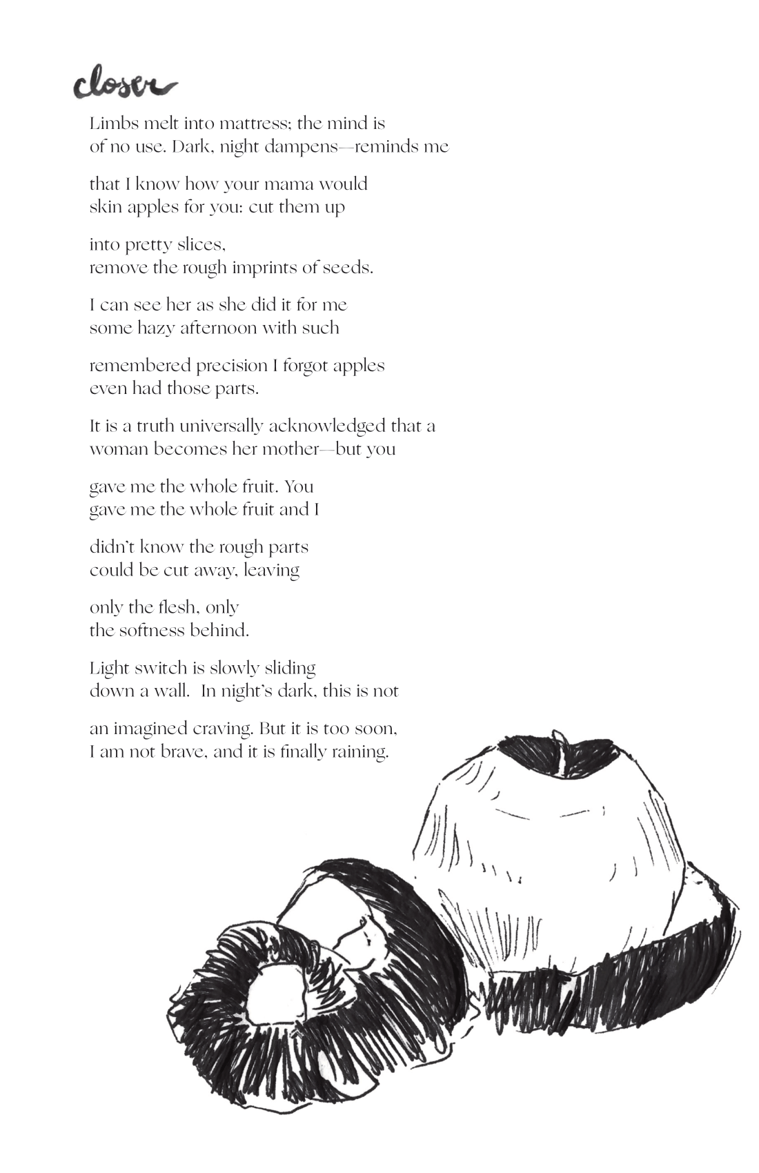
"Broadside for 'Closer by Journey Fetter'"
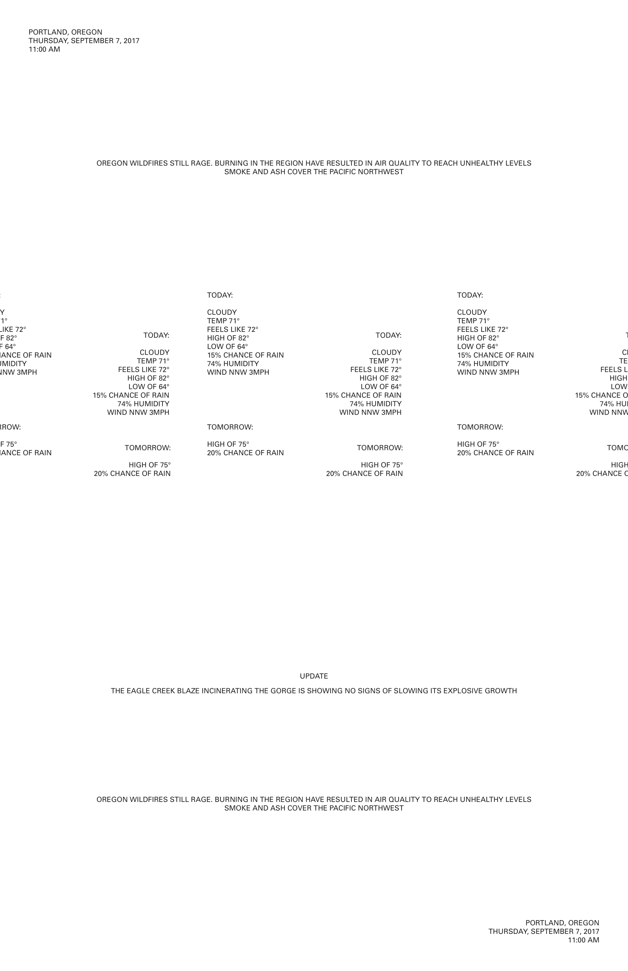
"Weather Permutation - One" 2018, Adobe Indesign
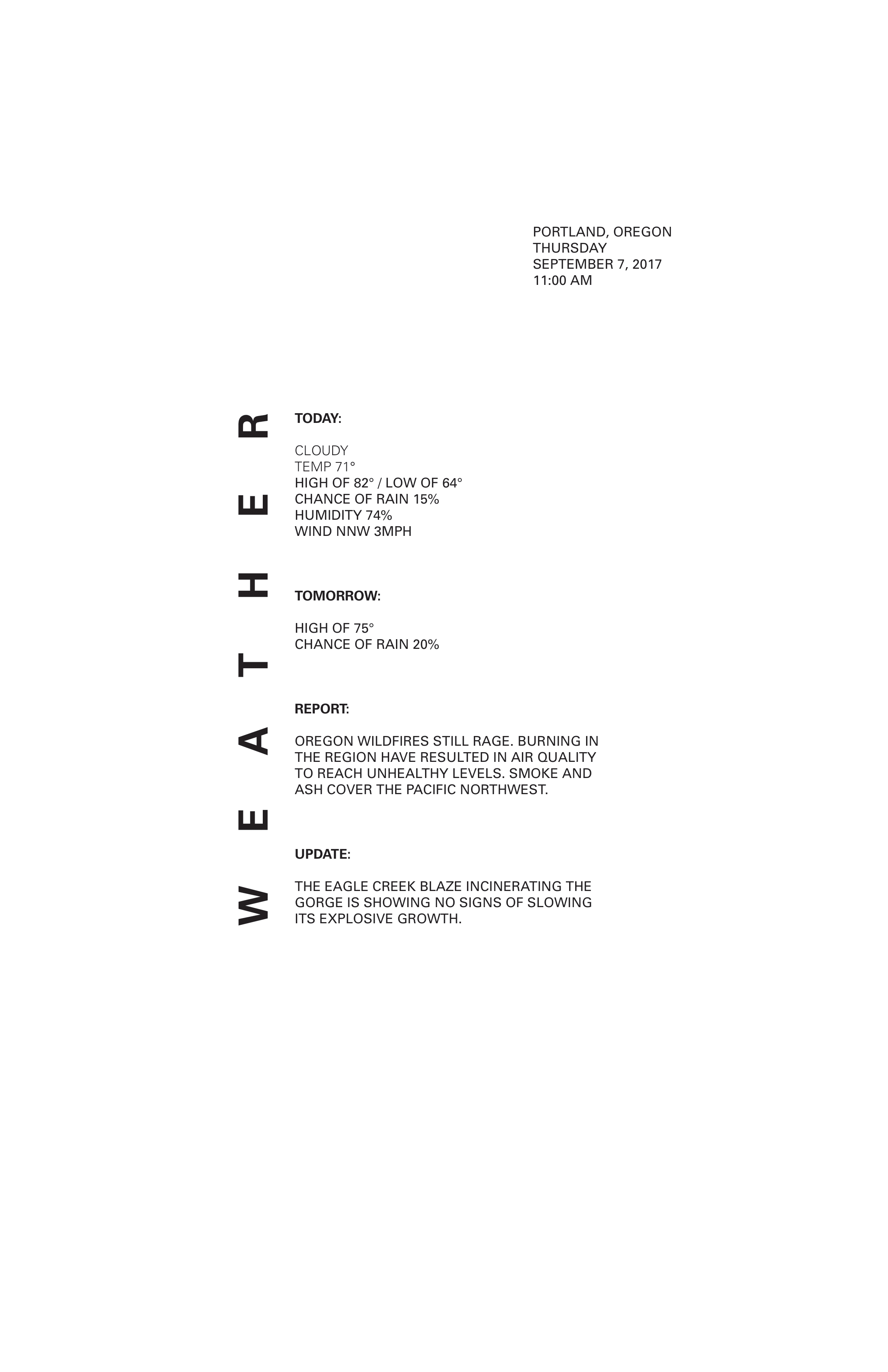
"Weather Permutation - Two" 2018, Adobe Indesign
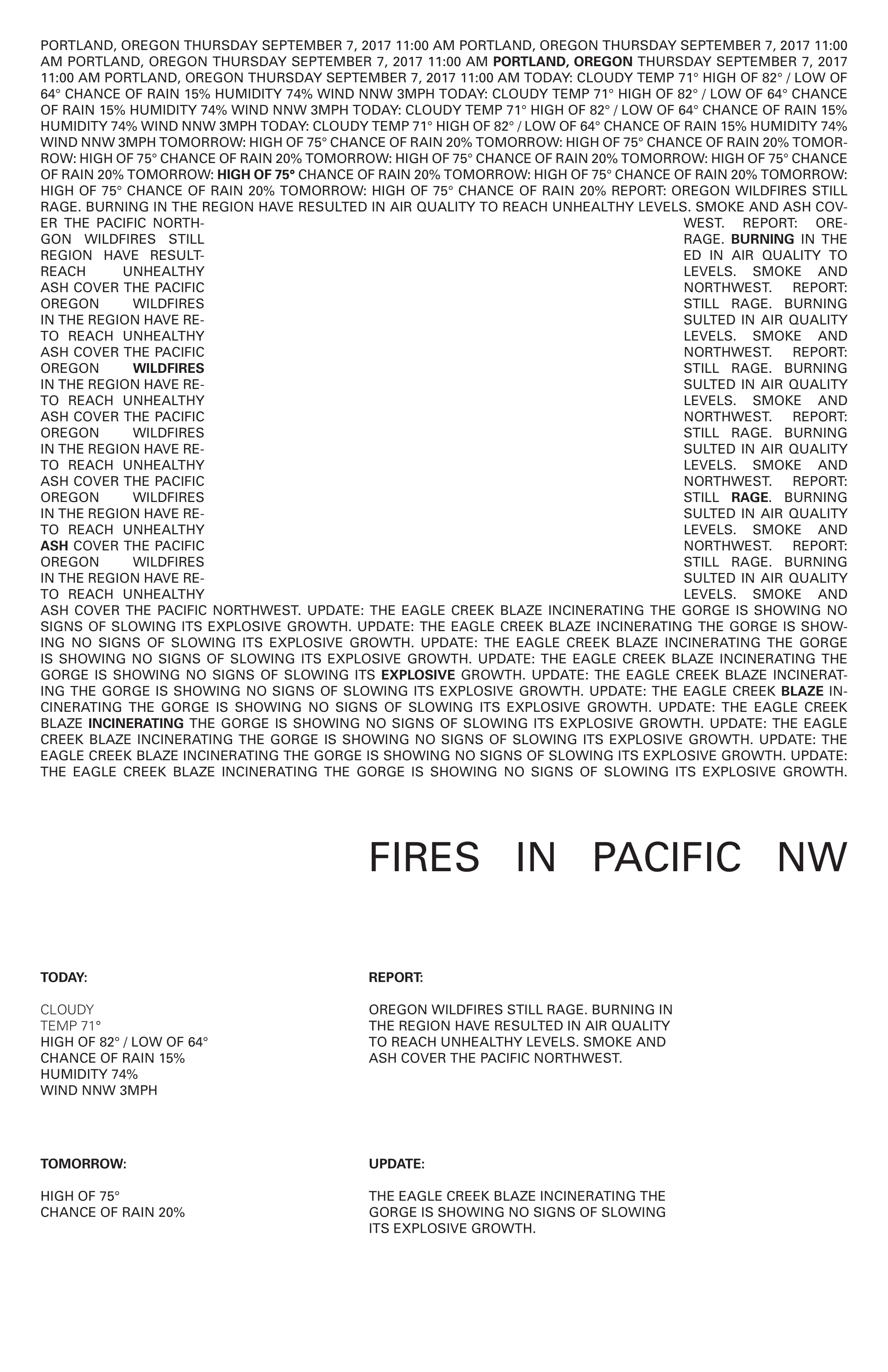
"Weather Permutation - Three" 2018, Adobe Indesign
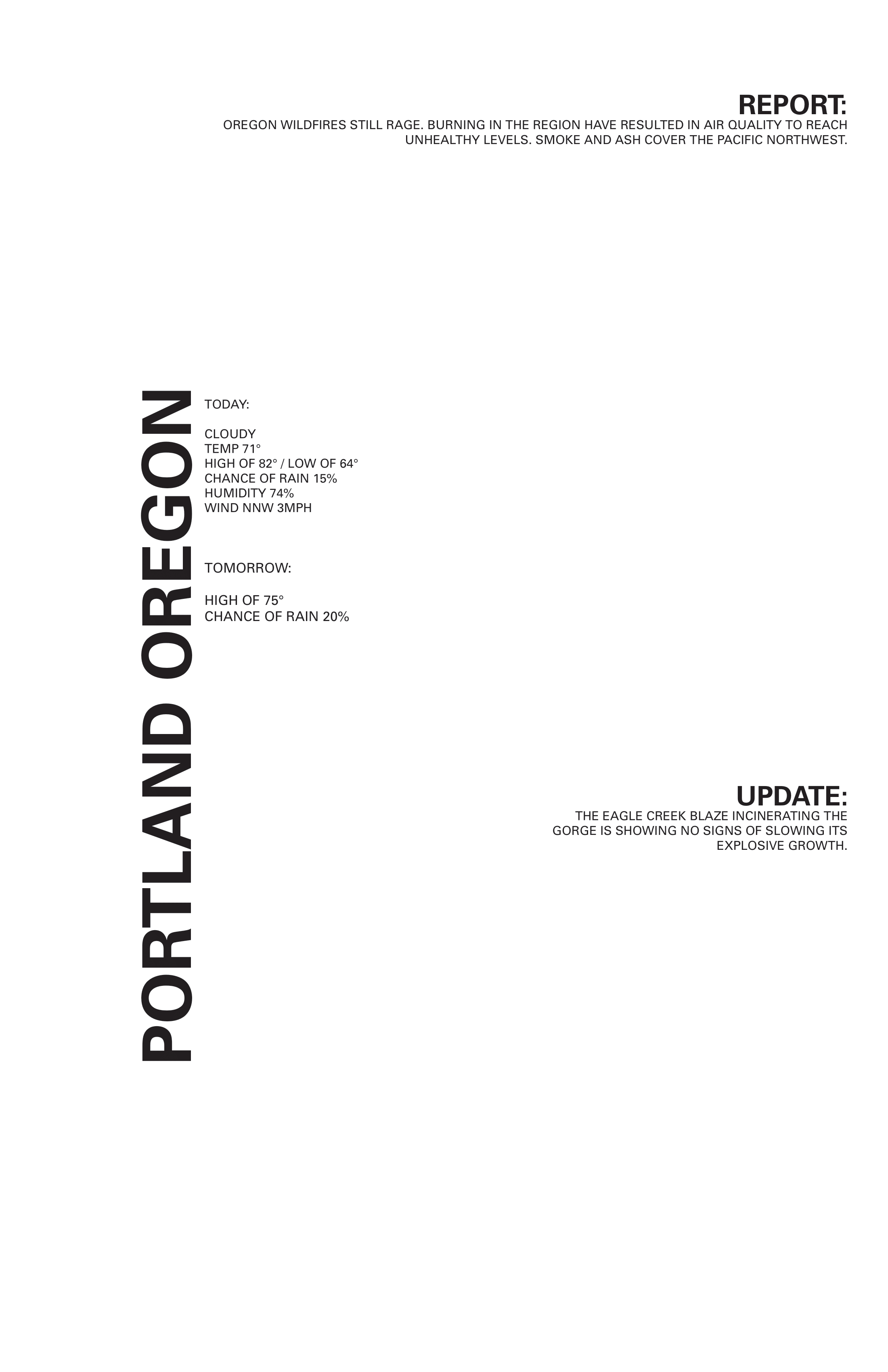
"Weather Permutation - Four" 2018, Adobe Indesign
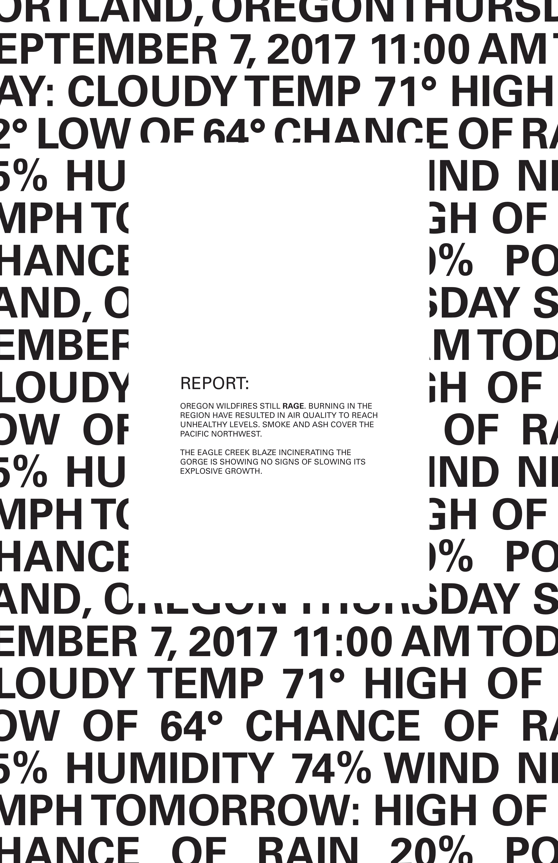
"Weather Permutation - Five" 2018, Adobe Indesign
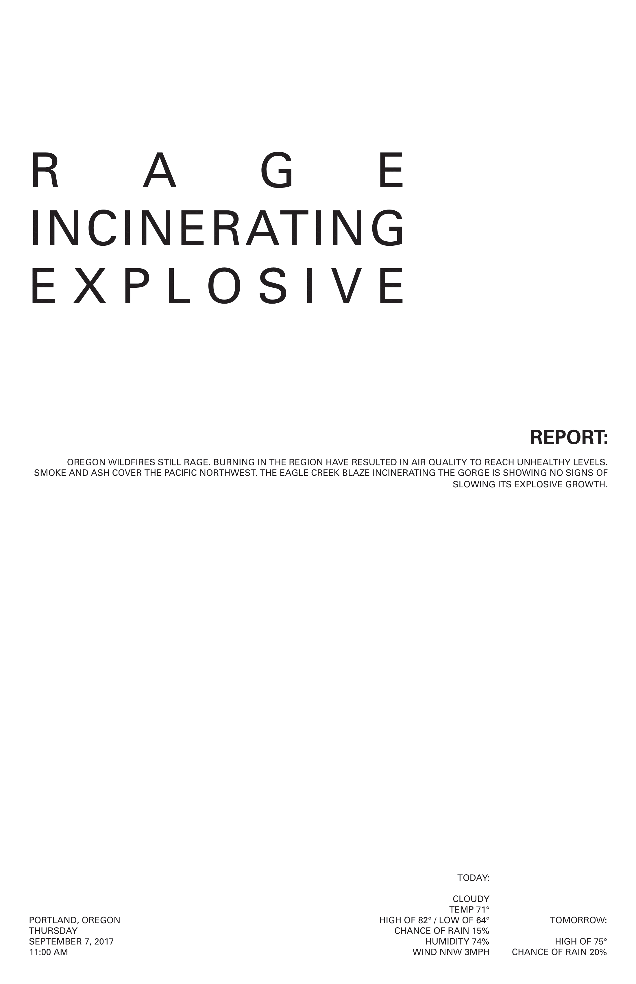
"Weather Permutation - Six" 2018, Adobe Indesign
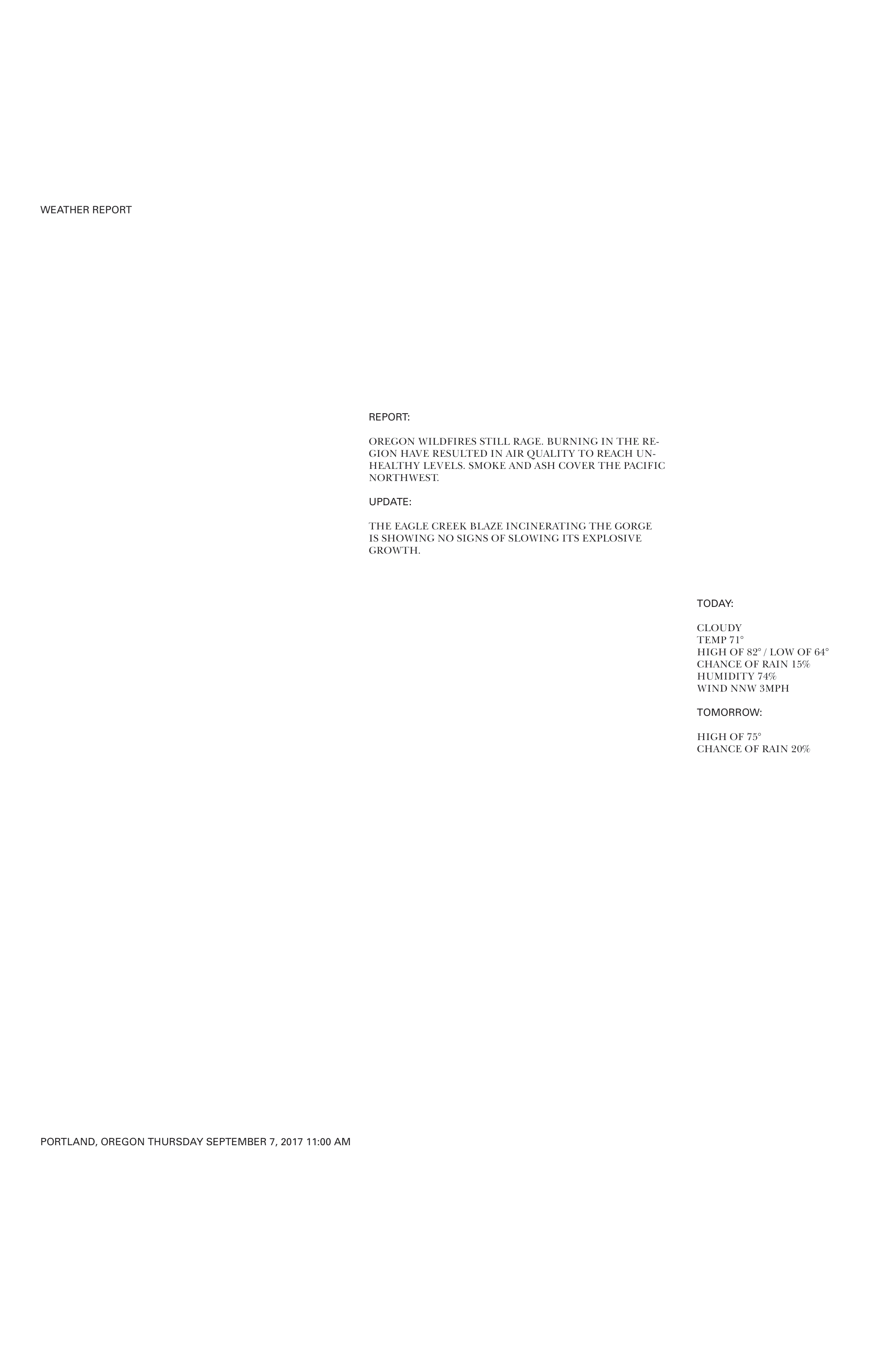
"Weather Permutation - Seven" 2018, Adobe Indesign
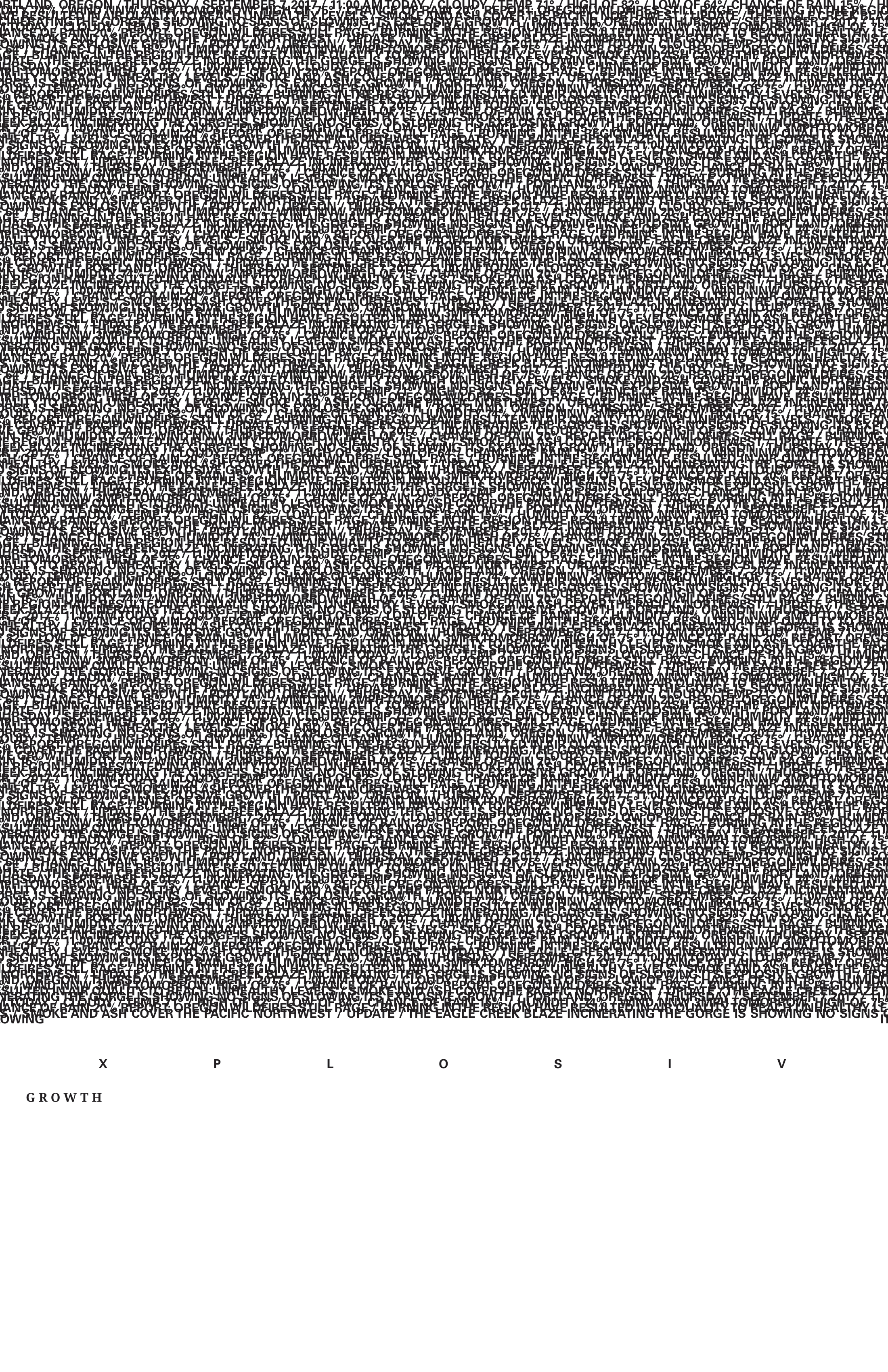
"Weather Permutation - Eight" 2018, Adobe Indesign
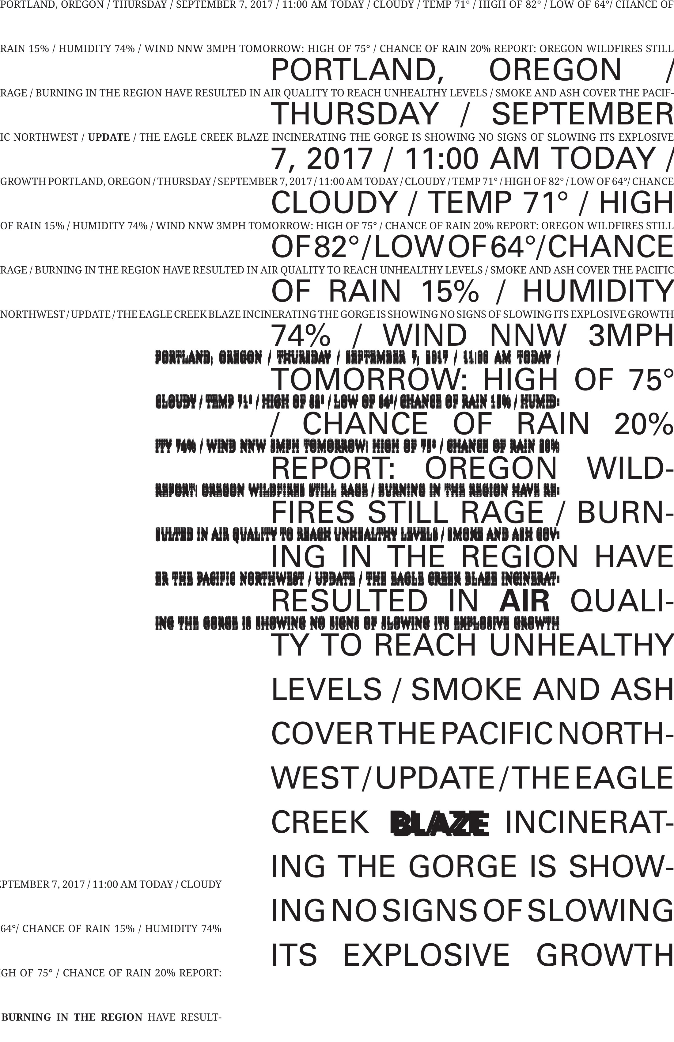
"Weather Permutation - Nine" 2018, Adobe Indesign
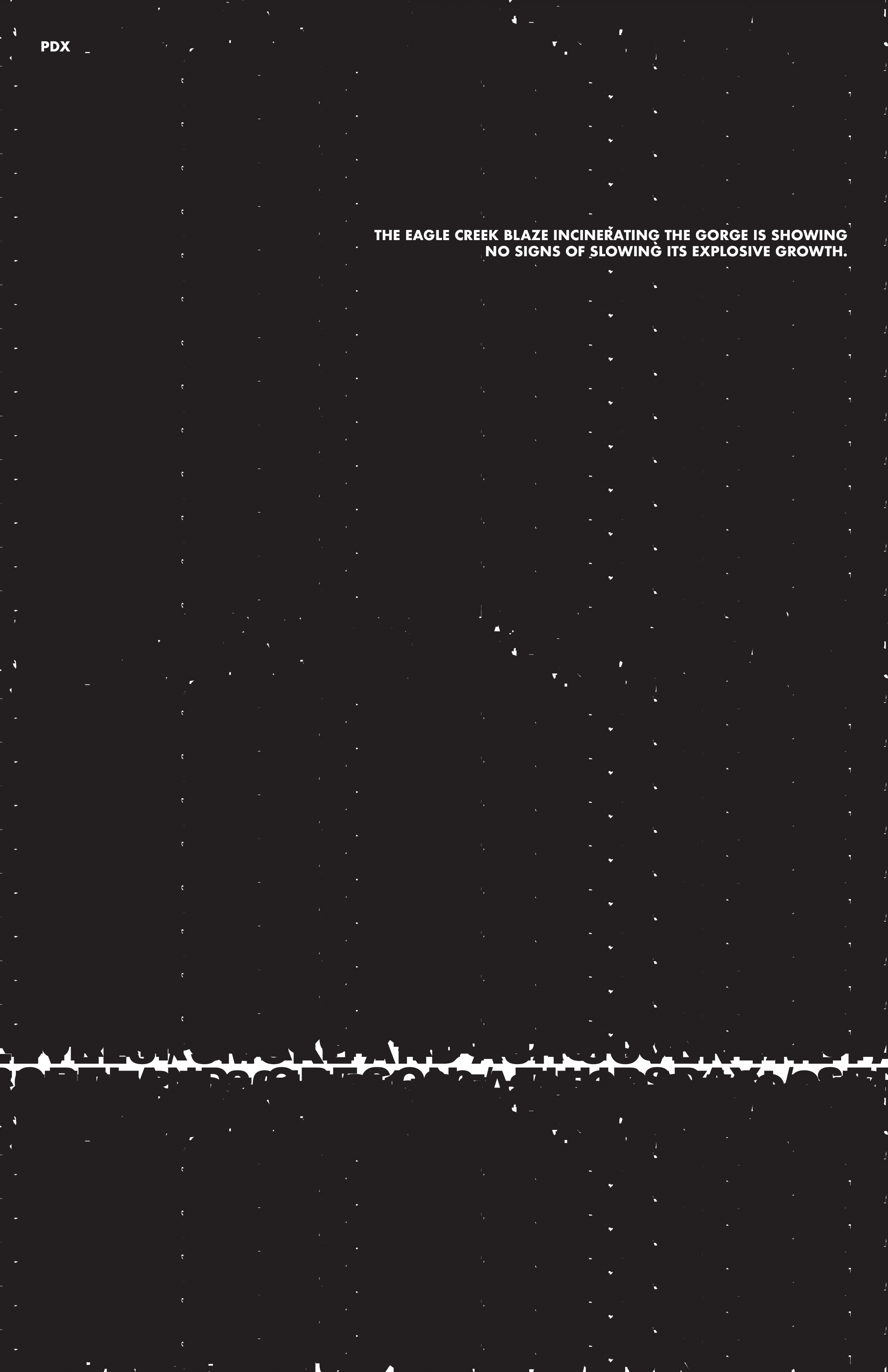
"Weather Permutation - Ten" 2018, Adobe Indesign
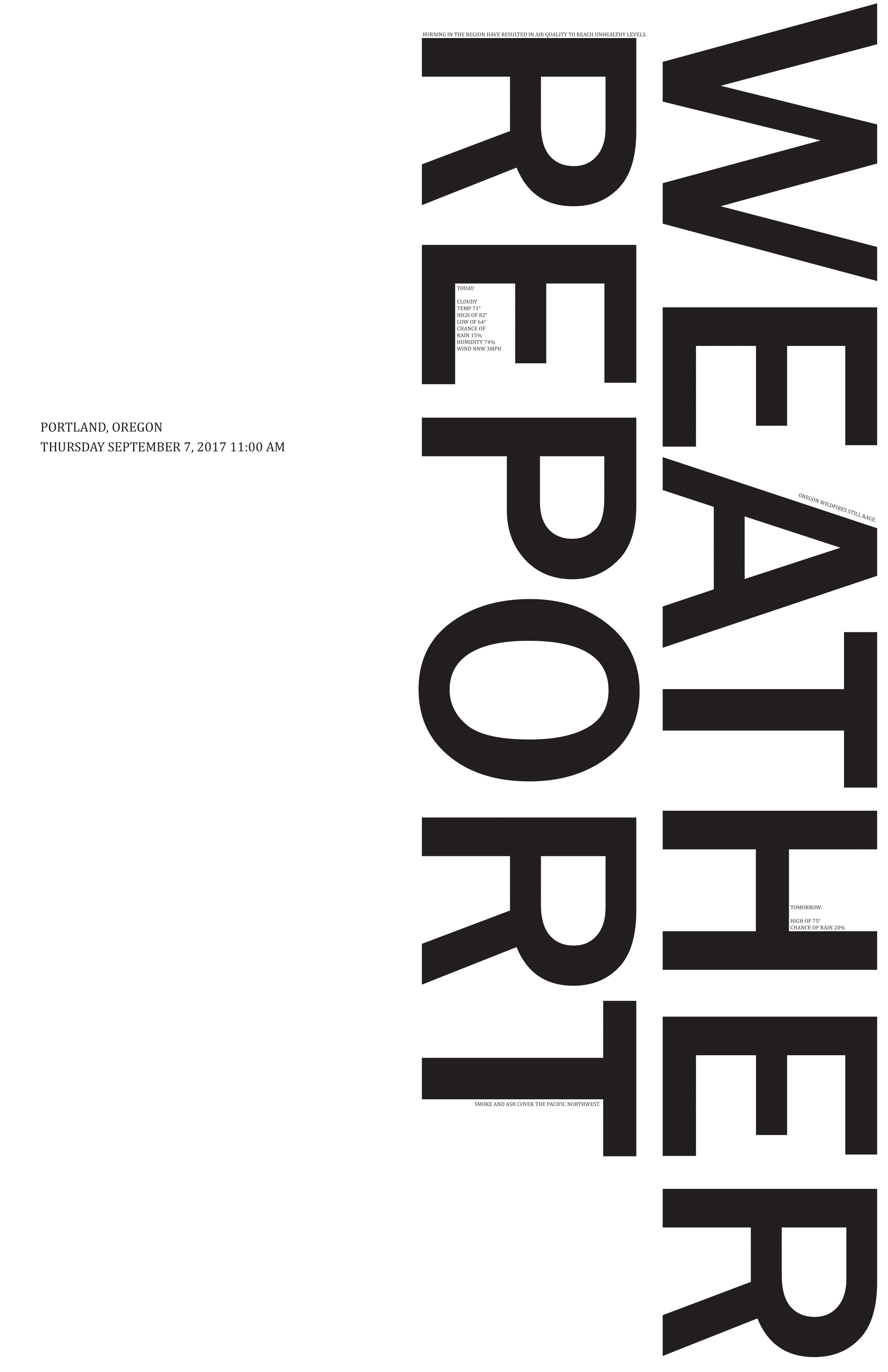
"Weather Permutation - Eleven" 2018, Adobe Indesign

"Weather Permutation - Twelve" 2018, Adobe Indesign
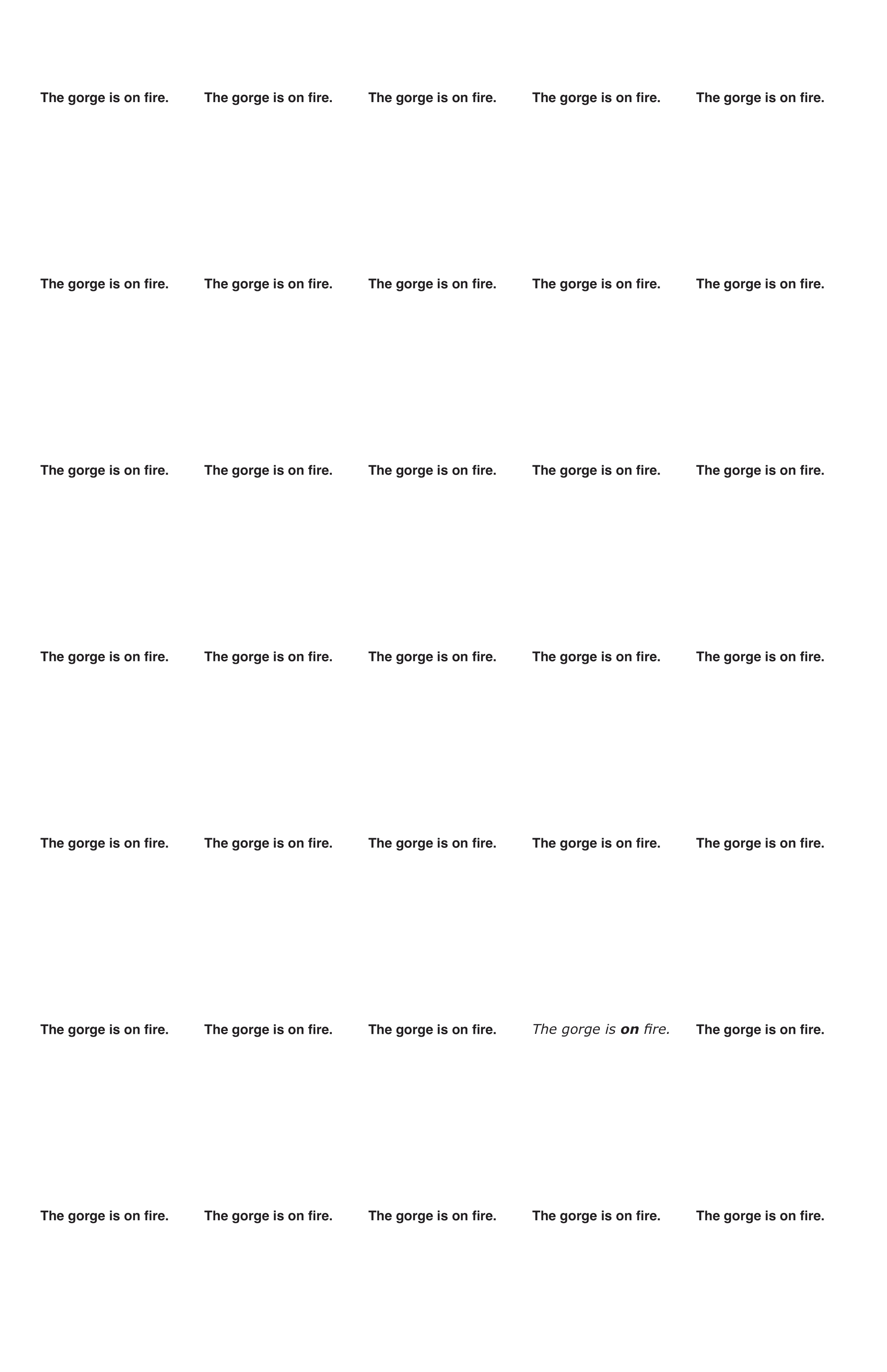
"Weather Permutation - Fourteen" 2018, Adobe Indesign
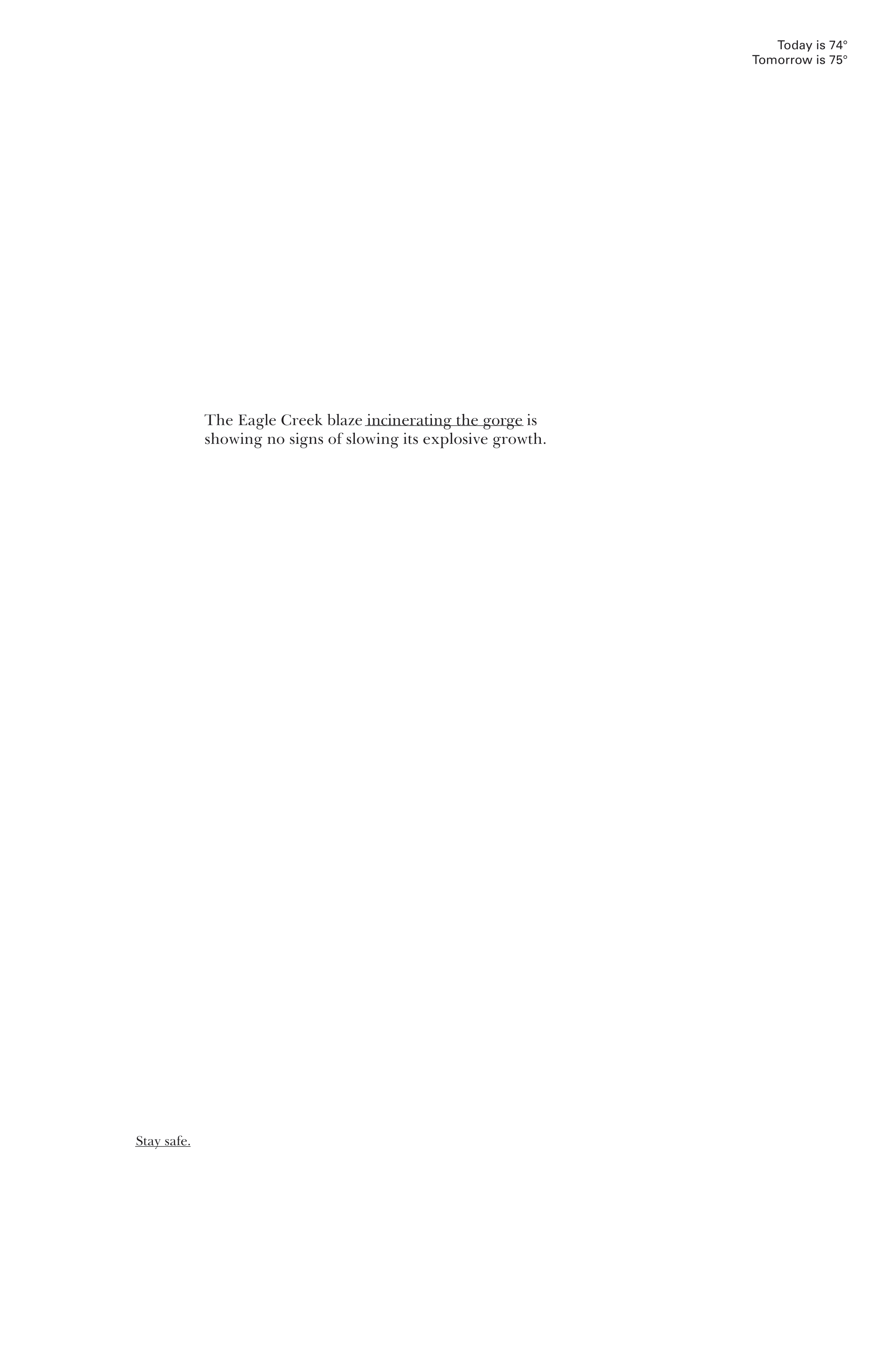
"Weather Permutation - Fifteen" 2018, Adobe Indesign
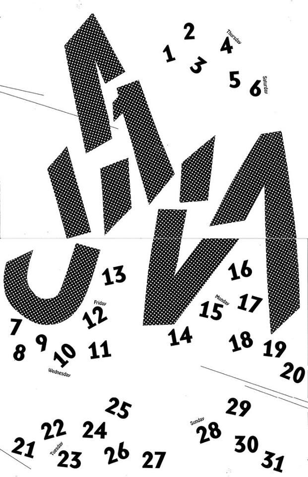
"January Calendar - One" cut paper on printer paper
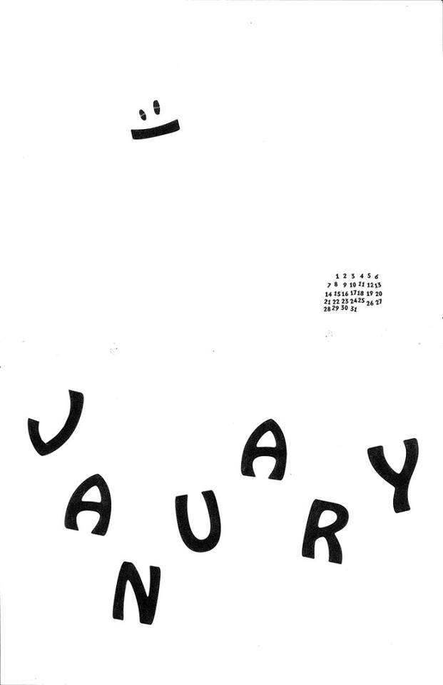
"January Calendar - Two" cut paper on printer paper
